

Bottle Design for Vodka Brands
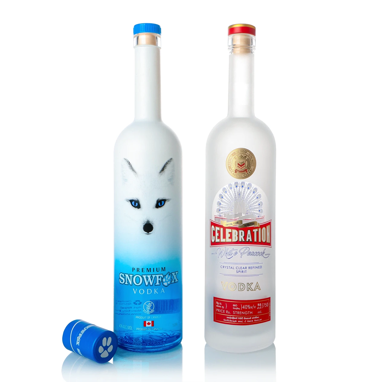
Vodka packaging competes in a very “at-a-glance” category. Shape, glass quality and detailing need to be precise rather than noisy.
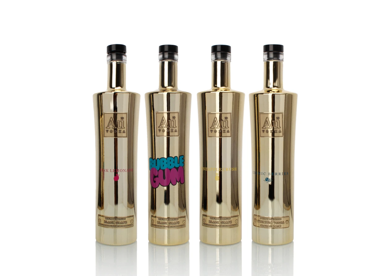
On this page you can show that you understand different directions within the vodka world:
- Classic, neutral styles that favour tall, straight silhouettes and high-clarity flint glass.
- Premium and luxury bottles with heavier bases, more sculpted transitions and carefully placed facets.
- Flavoured and infused lines where shape, colour and graphics need to communicate flavour and mixability.
When we design, we start from:
- Brand and price positioning (value, premium, luxury).
- Channels (retail, duty free, on-trade, e-commerce) and how the bottle will be seen.
- Label “billboard” area and how the pack reads from front, side and back bar.
Proportions, punt depth, base stability and shoulder geometry are engineered together so the bottle looks refined in visuals and behaves consistently on the line.